Turing Cyber — Translating Digital Security into Visual Identity
Turing Cyber — Translating Digital Security into Visual Identity
Turing Cyber — Translating Digital Security into Visual Identity
Turing Cyber — Translating Digital Security into Visual Identity
Year: 2024
Year: 2024
/
/
/
/
Industry: Cyber Security
Industry: Cyber Security
/
/
Type: Brand Design
Type: Brand Design

Brand Identity & Logo Design
Brand Identity & Logo Design
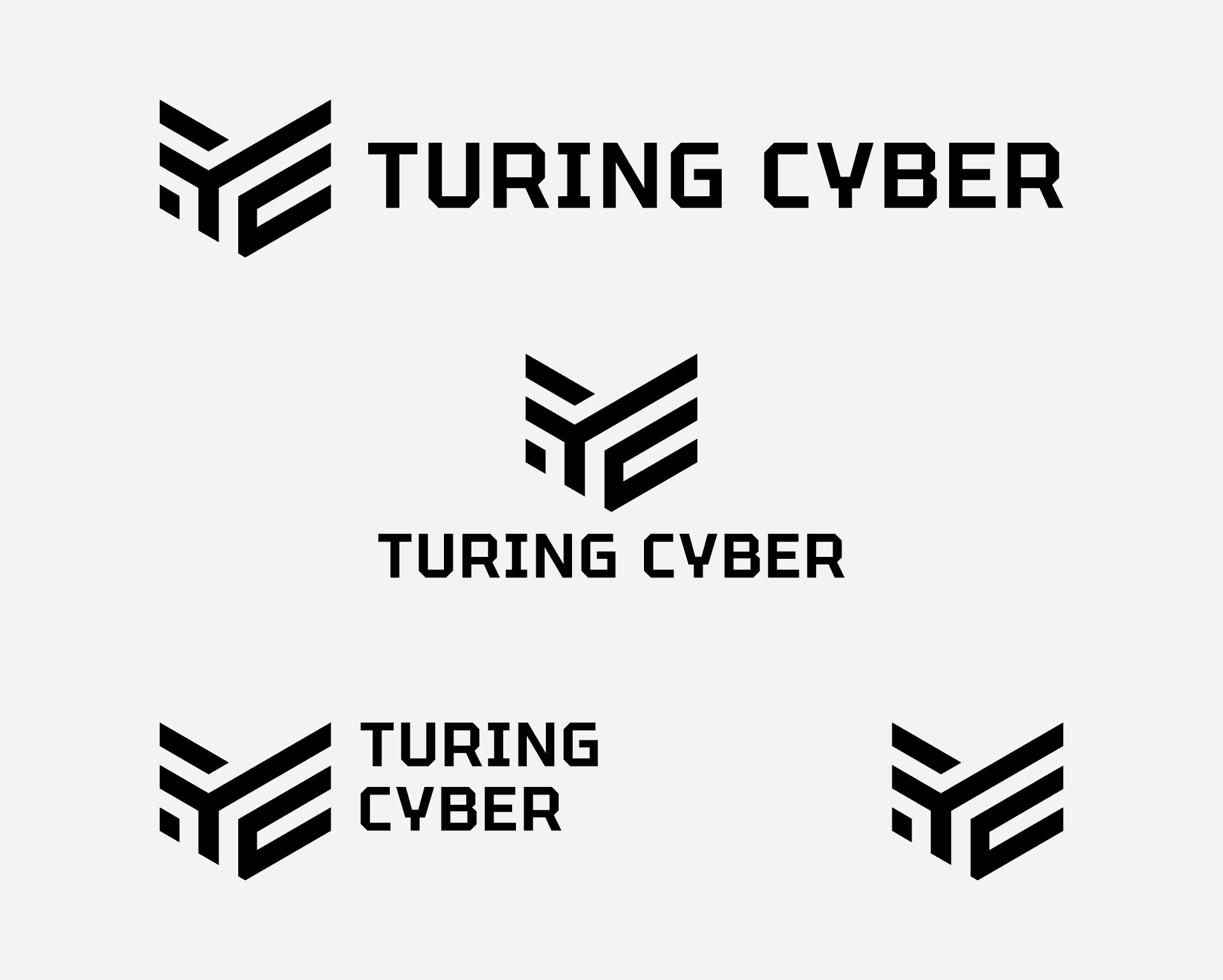
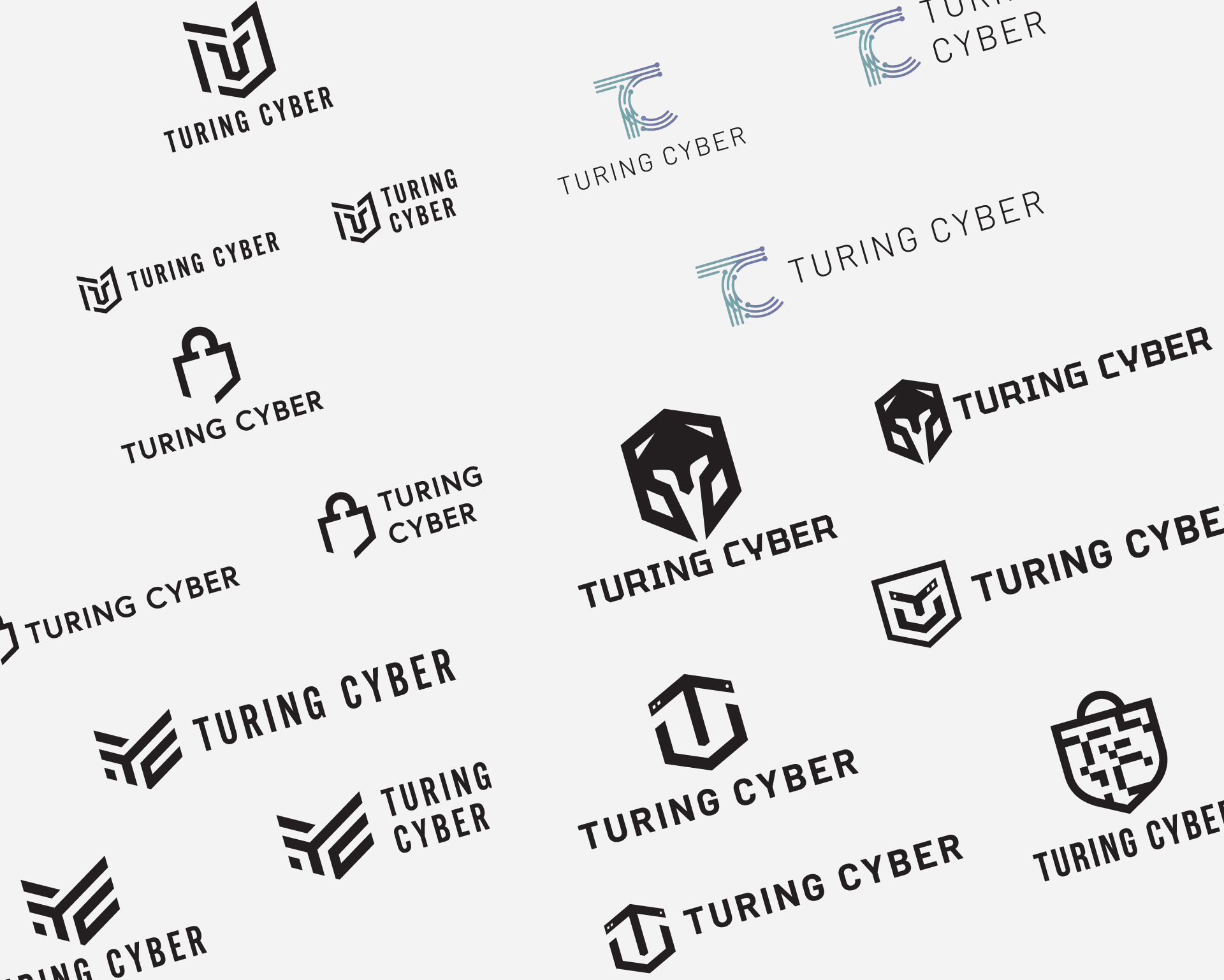
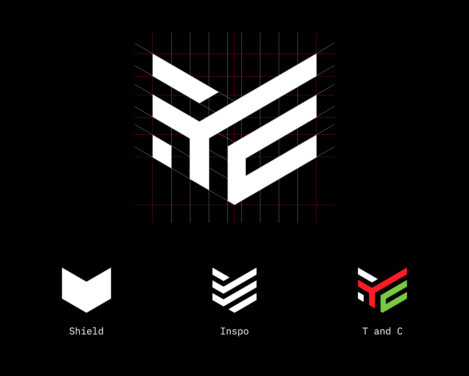
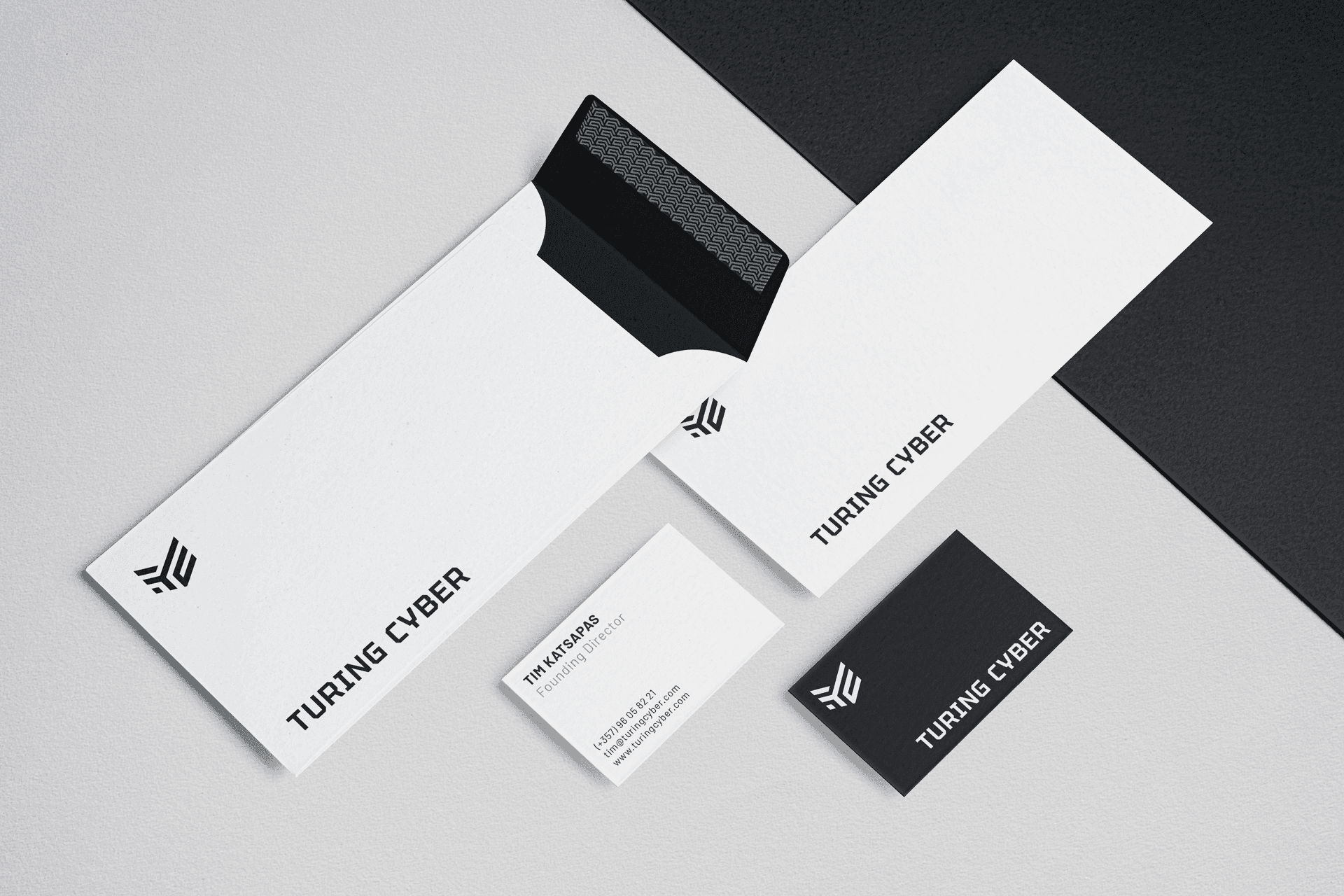
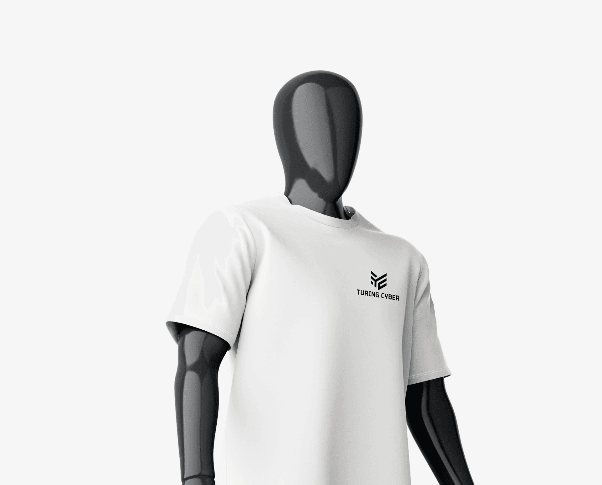
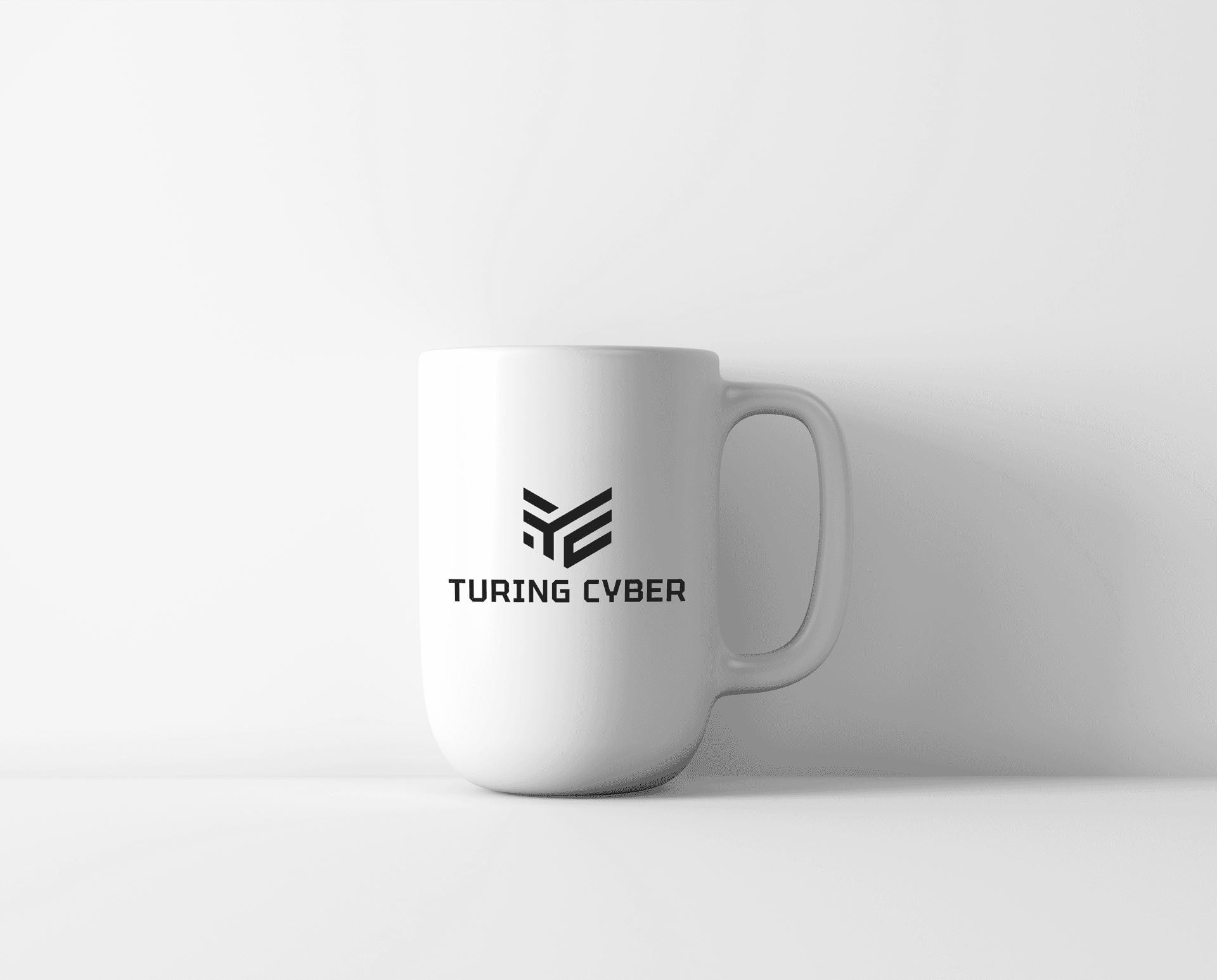
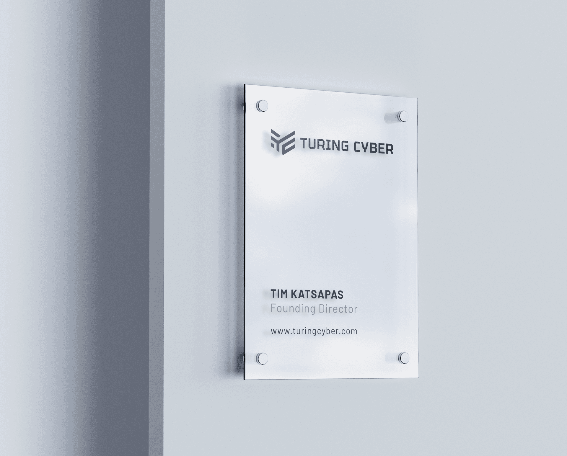
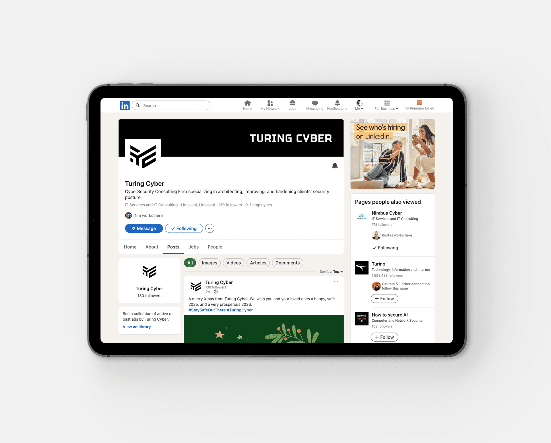
Turing Cyber is a cybersecurity startup founded and led by Tim Katsapas, a cybersecurity expert with an extensive background at Microsoft. The company provides advanced cybersecurity solutions, helping organizations protect themselves against evolving digital threats through consulting, training, risk assessments, and incident response. I was commissioned to develop the company’s logo and foundational brand identity, translating its technical expertise and commitment to digital security into a distinctive, modern visual identity. At the heart of the design is a shield, a universal symbol of protection, strength, and reliability. The initials “T” and “C” are seamlessly integrated into its structure, forming a unified mark that balances simplicity with a distinctive visual character. The clean geometric construction reflects Turing Cyber’s technical precision and forward-thinking approach, while its versatile design ensures consistency across digital and physical applications. The result is a confident and recognizable brand identity that communicates trust, resilience, and Turing Cyber’s commitment to safeguarding organizations in an increasingly complex digital world.
Turing Cyber is a cybersecurity startup founded and led by Tim Katsapas, a cybersecurity expert with an extensive background at Microsoft. The company provides advanced cybersecurity solutions, helping organizations protect themselves against evolving digital threats through consulting, training, risk assessments, and incident response. I was commissioned to develop the company’s logo and foundational brand identity, translating its technical expertise and commitment to digital security into a distinctive, modern visual identity. At the heart of the design is a shield, a universal symbol of protection, strength, and reliability. The initials “T” and “C” are seamlessly integrated into its structure, forming a unified mark that balances simplicity with a distinctive visual character. The clean geometric construction reflects Turing Cyber’s technical precision and forward-thinking approach, while its versatile design ensures consistency across digital and physical applications. The result is a confident and recognizable brand identity that communicates trust, resilience, and Turing Cyber’s commitment to safeguarding organizations in an increasingly complex digital world.
Type & Color
Type & Color
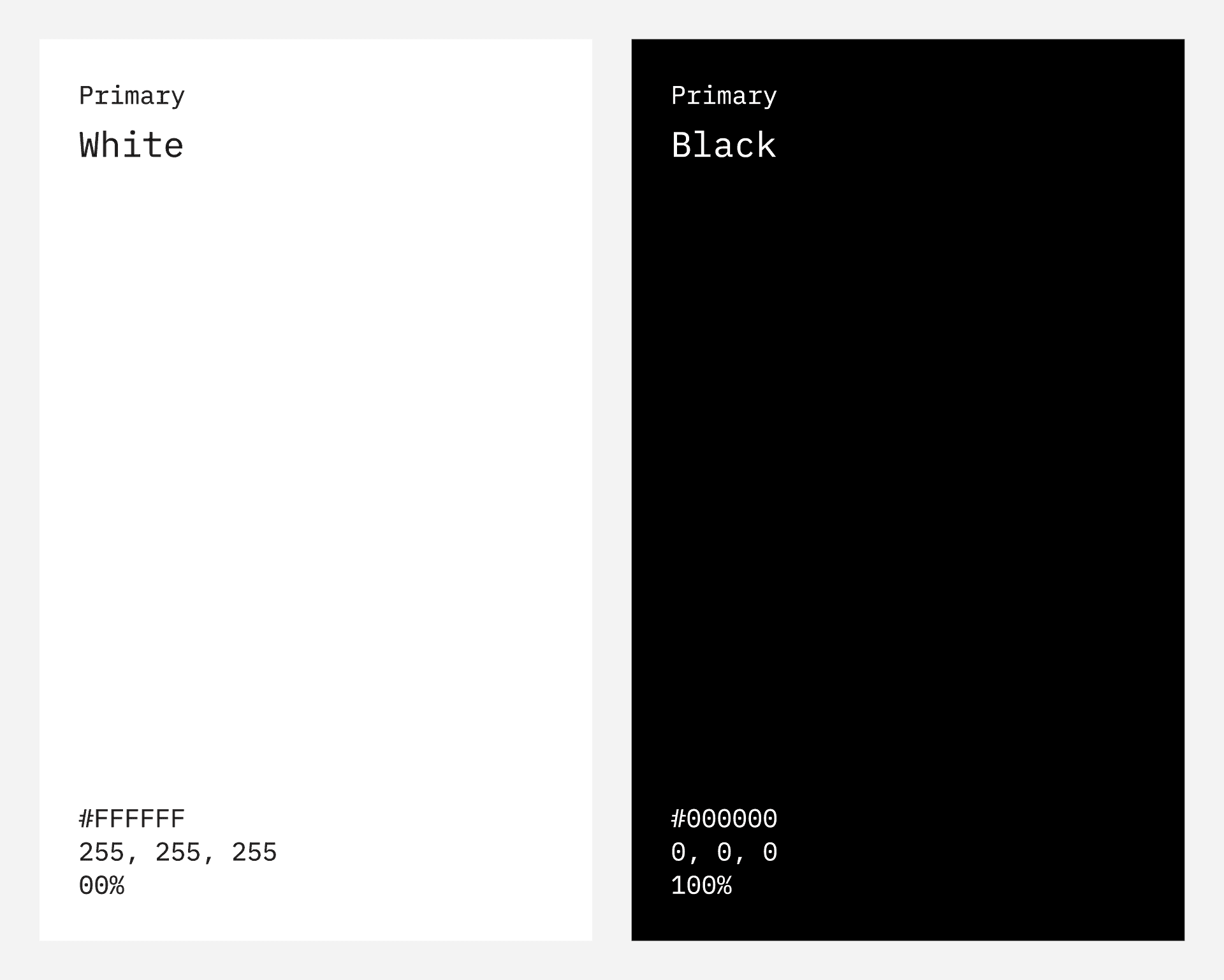
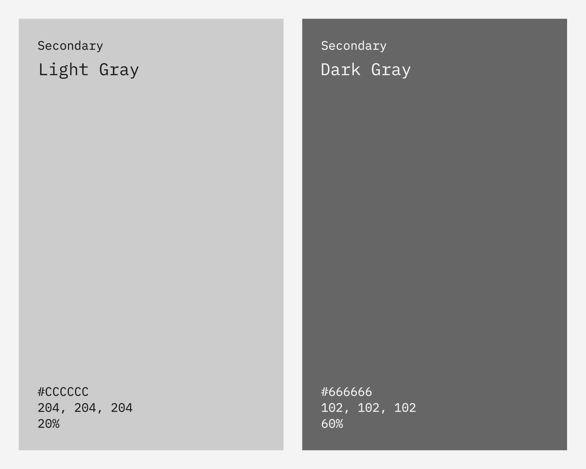
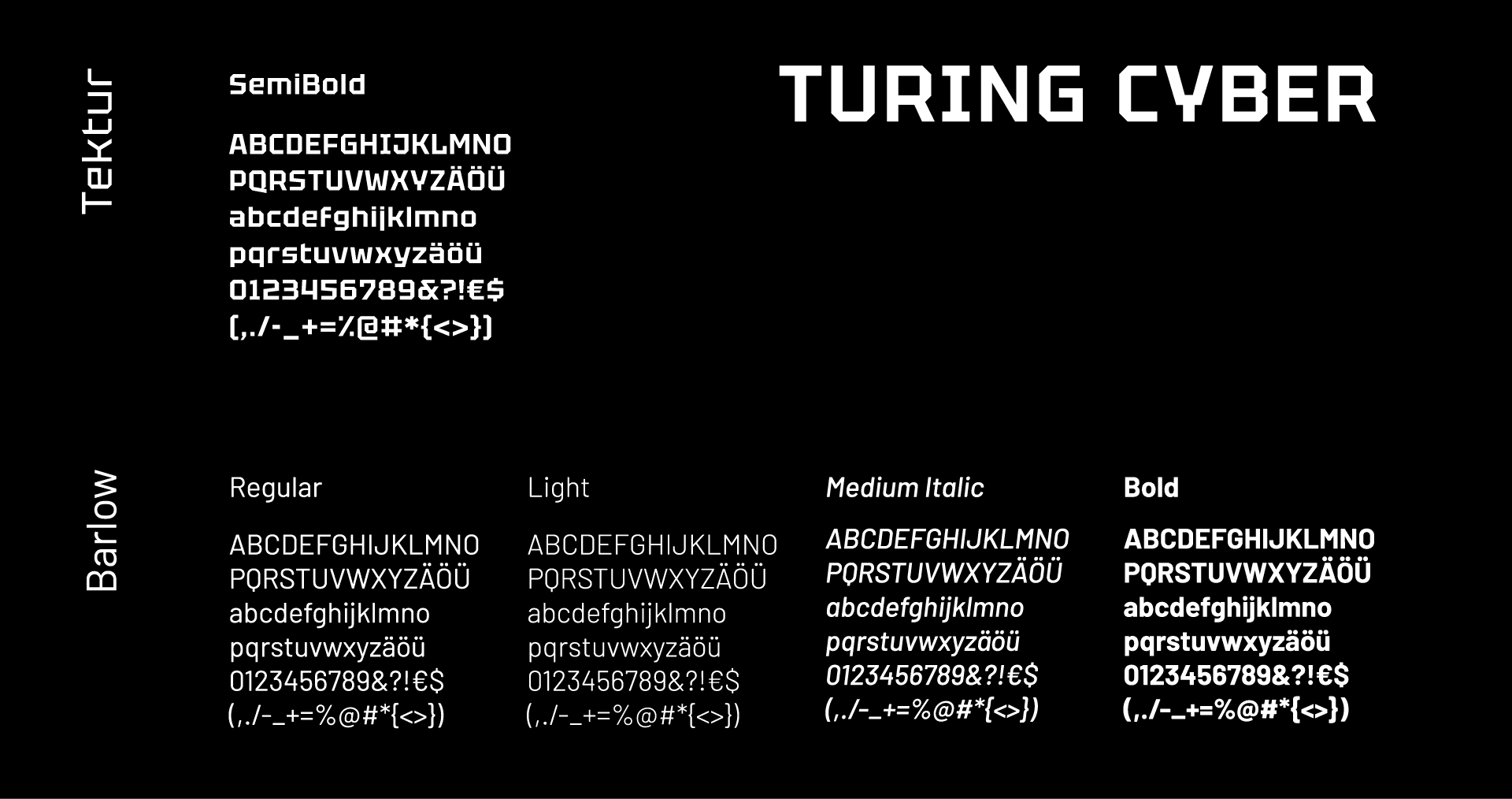
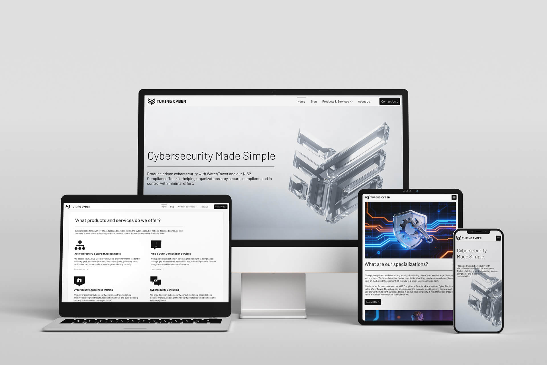
Initially, I aimed for a more serious representation of the Turing Cyber name using a Sans-Serif font. However, after discussions with Timmy, we decided to adopt a more technical, modern approach. With Tim’s approval, we selected the Tektur, Semibold font, which conveys a strong, secure, and protective image. Both Tim and I were pleased with the final combination of the logo and the font, resulting in a cohesive and professional identity. For the body copy, we chose the Barlow font to enhance the formality of the brand identity. The synergy between the logo and this font creates a harmonious visual experience. When selecting the color palette, my goal was to evoke feelings of seriousness and protection for our audience. As such, we opted for a classic black and white scheme for Tim’s company. The monochromatic nature of the logo allows for versatility, enabling the use of various colors and contrasts.
Initially, I aimed for a more serious representation of the Turing Cyber name using a Sans-Serif font. However, after discussions with Timmy, we decided to adopt a more technical, modern approach. With Tim’s approval, we selected the Tektur, Semibold font, which conveys a strong, secure, and protective image. Both Tim and I were pleased with the final combination of the logo and the font, resulting in a cohesive and professional identity. For the body copy, we chose the Barlow font to enhance the formality of the brand identity. The synergy between the logo and this font creates a harmonious visual experience. When selecting the color palette, my goal was to evoke feelings of seriousness and protection for our audience. As such, we opted for a classic black and white scheme for Tim’s company. The monochromatic nature of the logo allows for versatility, enabling the use of various colors and contrasts.
The Name
The Name
Tim decided to use the name “Turing Cyber” because it combines the realms of artificial intelligence and cybersecurity. While inspired by Alan Turing, the name emphasizes the quest to create technology that performs tasks indistinguishably from humans. The “Cyber” part highlights his commitment to securing digital spaces. Together, “Turing Cyber” represents his mission to innovate at the intersection of human and artificial intelligence, delivering solutions that are both secure and remarkably human-like.
Tim decided to use the name “Turing Cyber” because it combines the realms of artificial intelligence and cybersecurity. While inspired by Alan Turing, the name emphasizes the quest to create technology that performs tasks indistinguishably from humans. The “Cyber” part highlights his commitment to securing digital spaces. Together, “Turing Cyber” represents his mission to innovate at the intersection of human and artificial intelligence, delivering solutions that are both secure and remarkably human-like.

Tim’s Testimonial 🙌
Tim’s Testimonial 🙌
„Working with George is an absolute pleasure. From the start to the very end of our project - perfection! Giorgo was extremely clear in all his communications with me, he went way over and beyond to ensure that I was getting something I was satisfied with, and most importantly, he listened to what I was saying and did whatever alterations I requested. He is extremely professional and this shows in his work. He has helped me on numerous projects including creating a brand identity with my font and logo, he has assisted me even further with numerous marketing jobs which I needed some infographics, or to put together some professional content, and more importantly, he has taken it one step further and helped with printing various things including shirts, cards etc for me. I, 100% recommend George for any graphic design projects or needs you may have. He’s THE GUY when it comes to what he does!
„Working with George is an absolute pleasure. From the start to the very end of our project - perfection! Giorgo was extremely clear in all his communications with me, he went way over and beyond to ensure that I was getting something I was satisfied with, and most importantly, he listened to what I was saying and did whatever alterations I requested. He is extremely professional and this shows in his work. He has helped me on numerous projects including creating a brand identity with my font and logo, he has assisted me even further with numerous marketing jobs which I needed some infographics, or to put together some professional content, and more importantly, he has taken it one step further and helped with printing various things including shirts, cards etc for me. I, 100% recommend George for any graphic design projects or needs you may have. He’s THE GUY when it comes to what he does!
© 2026 George Saliaris Graphic & Web Designer LTD
© 2026 George Saliaris Graphic & Web Designer LTD
© 2026 George Saliaris Graphic & Web Designer LTD
© 2026 George Saliaris Graphic & Web Designer LTD