CareerAddict
CareerAddict
CareerAddict
Year: 2019
Year: 2019
Industry: Career Experts
Industry: Career Experts
Type: Web design
Type: Web design
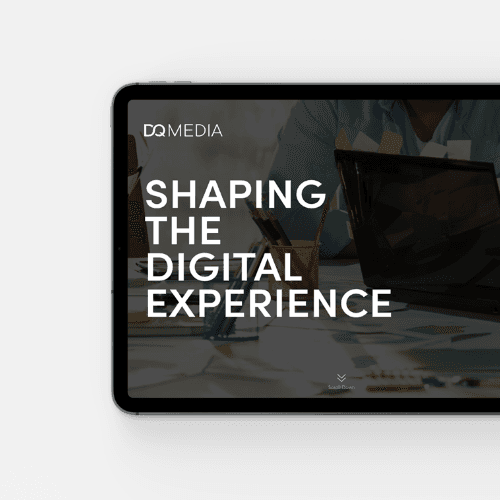
CareerAddict, operated by DeltaQuest Media Limited, serves as the core platform within a broader career-focused digital ecosystem. During my time as a designer at DQ Media, I worked as part of the in-house team on the redesign of the CareerAddict website, while also contributing to the design and visual structure of its platform extensions, HR Addict and CareerHunter. The goal across all platforms was to modernize the visual language, improve usability, and establish a cohesive, scalable system that could support different audiences and functions under one brand umbrella.
CareerAddict, operated by DeltaQuest Media Limited, serves as the core platform within a broader career-focused digital ecosystem. During my time as a designer at DQ Media, I worked as part of the in-house team on the redesign of the CareerAddict website, while also contributing to the design and visual structure of its platform extensions, HR Addict and CareerHunter. The goal across all platforms was to modernize the visual language, improve usability, and establish a cohesive, scalable system that could support different audiences and functions under one brand umbrella.
CareerAddict, operated by DeltaQuest Media Limited, serves as the core platform within a broader career-focused digital ecosystem. During my time as a designer at DQ Media, I worked as part of the in-house team on the redesign of the CareerAddict website, while also contributing to the design and visual structure of its platform extensions, HR Addict and CareerHunter. The goal across all platforms was to modernize the visual language, improve usability, and establish a cohesive, scalable system that could support different audiences and functions under one brand umbrella.


Web Design & Visual Language
Web Design & Visual Language
The visual redesign introduces a clean yet dynamic interface, balancing professional credibility with approachability. A refined colour palette, consistent typographic hierarchy, and modular layouts were used to improve readability while allowing visual flexibility across different content formats. Special attention was given to hero sections and promotional areas, such as newsletter sign-ups and product highlights, combining illustration, UI elements, and typography to guide user attention without overwhelming the interface. PLATFORM INTEGRATION CareerAddict was designed as a hub platform, connecting users to related services within its ecosystem. The redesign visually integrates HR Addict and CareerHunter through mockups and interface references, reinforcing brand cohesion while clearly distinguishing each platform’s role. This approach strengthens CareerAddict’s position as the central entry point for career development resources.
The visual redesign introduces a clean yet dynamic interface, balancing professional credibility with approachability. A refined colour palette, consistent typographic hierarchy, and modular layouts were used to improve readability while allowing visual flexibility across different content formats. Special attention was given to hero sections and promotional areas, such as newsletter sign-ups and product highlights, combining illustration, UI elements, and typography to guide user attention without overwhelming the interface. PLATFORM INTEGRATION CareerAddict was designed as a hub platform, connecting users to related services within its ecosystem. The redesign visually integrates HR Addict and CareerHunter through mockups and interface references, reinforcing brand cohesion while clearly distinguishing each platform’s role. This approach strengthens CareerAddict’s position as the central entry point for career development resources.

Sprite & Materials
Sprite & Materials
To support consistency and scalability, a set of custom sprites and UI materials was developed as part of the redesign process. These elements include icon systems, reusable graphic components, and interface patterns used across navigation, content categories, and feature highlights. Treating these assets as modular materials ensures visual coherence, speeds up design workflows, and provides a flexible foundation for future platform growth.
To support consistency and scalability, a set of custom sprites and UI materials was developed as part of the redesign process. These elements include icon systems, reusable graphic components, and interface patterns used across navigation, content categories, and feature highlights. Treating these assets as modular materials ensures visual coherence, speeds up design workflows, and provides a flexible foundation for future platform growth.


Navigation & Responsive
Navigation & Responsive
NAVIGATION Given the breadth of CareerAddict’s content, navigation was a central design challenge. The navigation system was redesigned to clearly structure key categories such as career planning, résumés, interviews, growth, and workplace topics. Dropdowns and menus were carefully organised to support quick scanning and intuitive access, reducing cognitive load for users navigating large content volumes. Navigation concepts were explored and refined through desktop and mobile mockups, ensuring consistency and usability across devices. RESPONSIVE DESIGN The redesign was approached with a responsive-first mindset, adapting layouts seamlessly across desktop, tablet, and mobile screens. Navigation, content blocks, and call-to-action elements were restructured for smaller viewports, ensuring accessibility and clarity without sacrificing functionality. This ensures a cohesive experience regardless of device, while preserving the platform’s visual identity.
NAVIGATION Given the breadth of CareerAddict’s content, navigation was a central design challenge. The navigation system was redesigned to clearly structure key categories such as career planning, résumés, interviews, growth, and workplace topics. Dropdowns and menus were carefully organised to support quick scanning and intuitive access, reducing cognitive load for users navigating large content volumes. Navigation concepts were explored and refined through desktop and mobile mockups, ensuring consistency and usability across devices. RESPONSIVE DESIGN The redesign was approached with a responsive-first mindset, adapting layouts seamlessly across desktop, tablet, and mobile screens. Navigation, content blocks, and call-to-action elements were restructured for smaller viewports, ensuring accessibility and clarity without sacrificing functionality. This ensures a cohesive experience regardless of device, while preserving the platform’s visual identity.


© 2026 George Saliaris Graphic & Web Designer LTD
© 2026 George Saliaris Graphic & Web Designer LTD
© 2026 George Saliaris Graphic & Web Designer LTD
© 2026 George Saliaris Graphic & Web Designer LTD