DQ Media
DQ Media
DQ Media
Year: 2018
Year: 2018
Industry: Digital Service
Industry: Digital Service
Type: Logo Redesign
Type: Logo Redesign
DQ Media (DeltaQuest Media) is a full-service digital agency specialising in tailored online solutions — including web development, graphic design, content strategy, social media and video marketing. The company combines creative design with technical execution to help brands and organisations build meaningful digital experiences. I worked with DQ Media for seven years, contributing to both brand and digital design initiatives. During this time, I collaborated closely with cross-functional teams to refine visual identities and support strategic design projects, including logo evolution, digital layouts and concept proposals for responsive websites.
DQ Media (DeltaQuest Media) is a full-service digital agency specialising in tailored online solutions — including web development, graphic design, content strategy, social media and video marketing. The company combines creative design with technical execution to help brands and organisations build meaningful digital experiences. I worked with DQ Media for seven years, contributing to both brand and digital design initiatives. During this time, I collaborated closely with cross-functional teams to refine visual identities and support strategic design projects, including logo evolution, digital layouts and concept proposals for responsive websites.
DQ Media (DeltaQuest Media) is a full-service digital agency specialising in tailored online solutions — including web development, graphic design, content strategy, social media and video marketing. The company combines creative design with technical execution to help brands and organisations build meaningful digital experiences. I worked with DQ Media for seven years, contributing to both brand and digital design initiatives. During this time, I collaborated closely with cross-functional teams to refine visual identities and support strategic design projects, including logo evolution, digital layouts and concept proposals for responsive websites.


Logo Redesign
Logo Redesign
The original logo had a very minimal and neutral appearance, which made it versatile but limited its visual differentiation in digital environments. The goal of the redesign was to retain its simplicity while giving it a more contemporary and distinctive character. I refined the typography and proportions to achieve a cleaner, more balanced mark that works effectively across digital and print applications. A key conceptual decision was the connection of the letters “D” and “Q”. This connection is inspired by the idea of a hyperlink — a fundamental element of the digital world that represents connectivity, navigation, and interaction. As a digital-focused company working with web development, coding, and online experiences, DQ Media operates at the intersection of structure and connection. The linked letterforms symbolize how different digital elements come together seamlessly, reflecting the company’s role in creating cohesive and connected digital solutions.
The original logo had a very minimal and neutral appearance, which made it versatile but limited its visual differentiation in digital environments. The goal of the redesign was to retain its simplicity while giving it a more contemporary and distinctive character. I refined the typography and proportions to achieve a cleaner, more balanced mark that works effectively across digital and print applications. A key conceptual decision was the connection of the letters “D” and “Q”. This connection is inspired by the idea of a hyperlink — a fundamental element of the digital world that represents connectivity, navigation, and interaction. As a digital-focused company working with web development, coding, and online experiences, DQ Media operates at the intersection of structure and connection. The linked letterforms symbolize how different digital elements come together seamlessly, reflecting the company’s role in creating cohesive and connected digital solutions.


Type & Color
Type & Color
COLOR CONCEPT The color palette was intentionally kept restrained. A neutral base combined with subtle accents supports a professional and trustworthy brand presence while allowing flexibility across different media and client projects. This approach ensures that the brand remains timeless and adaptable rather than trend-driven. TYPOGRAPHY The typographic system for DQ Media is based on a clear hierarchy between brand expression and readability. The logotype “DQ Media” is set in Raleway, which was customized and visually refined to achieve a stronger, more distinctive presence. The weight was adjusted to appear bolder and more confident, reinforcing the brand’s contemporary and professional character while maintaining a clean, modern feel. For body text and extended content, Sofia Pro was selected. Its neutral, highly legible design makes it well suited for long-form reading and functional communication. Sofia Pro is used consistently across digital interfaces and print applications, including the website, business cards, and A4 materials. Together, Raleway and Sofia Pro create a balanced typographic system: expressive where brand recognition is needed, and restrained where clarity and usability are essential.
COLOR CONCEPT The color palette was intentionally kept restrained. A neutral base combined with subtle accents supports a professional and trustworthy brand presence while allowing flexibility across different media and client projects. This approach ensures that the brand remains timeless and adaptable rather than trend-driven. TYPOGRAPHY The typographic system for DQ Media is based on a clear hierarchy between brand expression and readability. The logotype “DQ Media” is set in Raleway, which was customized and visually refined to achieve a stronger, more distinctive presence. The weight was adjusted to appear bolder and more confident, reinforcing the brand’s contemporary and professional character while maintaining a clean, modern feel. For body text and extended content, Sofia Pro was selected. Its neutral, highly legible design makes it well suited for long-form reading and functional communication. Sofia Pro is used consistently across digital interfaces and print applications, including the website, business cards, and A4 materials. Together, Raleway and Sofia Pro create a balanced typographic system: expressive where brand recognition is needed, and restrained where clarity and usability are essential.


Website Proposal
Website Proposal
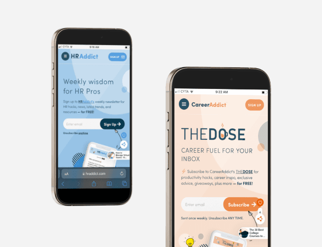
The project focused on the development of a website concept and visual proposal as a strategic foundation for a future redesign of DQ Media’s digital presence. The work explored structure, content hierarchy, and overall visual direction, with a strong emphasis on clarity, typographic rhythm, and a restrained, contemporary aesthetic. The proposal was designed responsively, with layouts developed for desktop, tablet, and mobile devices, ensuring consistency across different screen sizes. Conceived as a design exploration, the proposal outlines a flexible framework for how the agency’s website could evolve, supporting scalability, clarity, and a coherent digital identity.
The project focused on the development of a website concept and visual proposal as a strategic foundation for a future redesign of DQ Media’s digital presence. The work explored structure, content hierarchy, and overall visual direction, with a strong emphasis on clarity, typographic rhythm, and a restrained, contemporary aesthetic. The proposal was designed responsively, with layouts developed for desktop, tablet, and mobile devices, ensuring consistency across different screen sizes. Conceived as a design exploration, the proposal outlines a flexible framework for how the agency’s website could evolve, supporting scalability, clarity, and a coherent digital identity.

© 2026 George Saliaris Graphic & Web Designer LTD
© 2026 George Saliaris Graphic & Web Designer LTD
© 2026 George Saliaris Graphic & Web Designer LTD
© 2026 George Saliaris Graphic & Web Designer LTD