Leanna Glava - Architect
Leanna Glava - Architect
Leanna Glava - Architect
Year: 2024
Year: 2024
Industry: Architect
Industry: Architect
Type: Brand design
Type: Brand design
This project began with a series of hand-drawn sketches by Leanna Glava, in which she outlined the core idea for her logo and commissioned the design of a business card. Her intention was to create a mark rooted in architectural drawing, using Greek initials, line weight, and construction logic as the foundation. Based on her sketches and explanations, the logo was refined, structured, and vectorised, while preserving the original conceptual clarity. The final mark translates her initial idea into a precise geometric system suitable for both print and digital applications. Leanna Glava works across multiple creative disciplines, combining architecture and design, painting, and LEMON ART jewellery. As an Architectural Designer, her work is characterised by a strong connection between structure, material, and artistic expression — a balance that is reflected in the final logo design.
This project began with a series of hand-drawn sketches by Leanna Glava, in which she outlined the core idea for her logo and commissioned the design of a business card. Her intention was to create a mark rooted in architectural drawing, using Greek initials, line weight, and construction logic as the foundation. Based on her sketches and explanations, the logo was refined, structured, and vectorised, while preserving the original conceptual clarity. The final mark translates her initial idea into a precise geometric system suitable for both print and digital applications. Leanna Glava works across multiple creative disciplines, combining architecture and design, painting, and LEMON ART jewellery. As an Architectural Designer, her work is characterised by a strong connection between structure, material, and artistic expression — a balance that is reflected in the final logo design.
This project began with a series of hand-drawn sketches by Leanna Glava, in which she outlined the core idea for her logo and commissioned the design of a business card. Her intention was to create a mark rooted in architectural drawing, using Greek initials, line weight, and construction logic as the foundation. Based on her sketches and explanations, the logo was refined, structured, and vectorised, while preserving the original conceptual clarity. The final mark translates her initial idea into a precise geometric system suitable for both print and digital applications. Leanna Glava works across multiple creative disciplines, combining architecture and design, painting, and LEMON ART jewellery. As an Architectural Designer, her work is characterised by a strong connection between structure, material, and artistic expression — a balance that is reflected in the final logo design.


Logotype & Application
Logotype & Application
The logo is derived from the Greek initials Γ (Gamma), Λ (Lambda), and Α (Alpha), referencing the name Leanna Glavas (Leanna from Anna and Lemonia, Glavas as the surname). The letterforms are constructed through the interaction of solid and fine lines, following the visual conventions of architectural drawings. Thick lines represent primary structure and walls, while thin lines indicate secondary elements, reference axes, or spatial guidance. This contrast establishes a clear structural hierarchy within the mark itself. The result is a geometric symbol rooted in architectural notation — precise and rational in its construction, yet intuitive and visually balanced in its final form. The thin lines are intentionally not treated as closed shapes. Instead, they are designed to extend beyond the core mark, allowing the identity to expand into layouts, margins, and applications. This approach reflects the architectural process, where lines begin as guides and reference systems before evolving into defined structure and space. What starts as a drawing continues into a spatial idea. In applications such as the business card, these fine lines extend into the surrounding format, creating a subtle connection between logo and composition. Rather than containing the mark within a fixed boundary, the system allows it to interact with its environment. The logo therefore operates not as a static symbol, but as a flexible graphic framework that adapts while maintaining structural coherence.
The logo is derived from the Greek initials Γ (Gamma), Λ (Lambda), and Α (Alpha), referencing the name Leanna Glavas (Leanna from Anna and Lemonia, Glavas as the surname). The letterforms are constructed through the interaction of solid and fine lines, following the visual conventions of architectural drawings. Thick lines represent primary structure and walls, while thin lines indicate secondary elements, reference axes, or spatial guidance. This contrast establishes a clear structural hierarchy within the mark itself. The result is a geometric symbol rooted in architectural notation — precise and rational in its construction, yet intuitive and visually balanced in its final form. The thin lines are intentionally not treated as closed shapes. Instead, they are designed to extend beyond the core mark, allowing the identity to expand into layouts, margins, and applications. This approach reflects the architectural process, where lines begin as guides and reference systems before evolving into defined structure and space. What starts as a drawing continues into a spatial idea. In applications such as the business card, these fine lines extend into the surrounding format, creating a subtle connection between logo and composition. Rather than containing the mark within a fixed boundary, the system allows it to interact with its environment. The logo therefore operates not as a static symbol, but as a flexible graphic framework that adapts while maintaining structural coherence.


Color
Color
The color palette is based exclusively on black, white, and a controlled range of grey tones, moving from dense to almost transparent values. Rather than introducing color as an expressive element, the palette reflects the material reality of architecture — concrete, buildings, and constructed space. The greys recall the color of cement, raw surfaces, and modern urban structures. They convey seriousness, stability, and professionalism, while maintaining a calm and balanced presence. Subtle tonal shifts create hierarchy and depth without visual noise, supporting a quiet, harmonious design process. The restrained palette reinforces a sense of trust and clarity, allowing form, structure, and proportion to remain the focus. Overall, the colors express modernity and harmony — grounded, reliable, and timeless.
The color palette is based exclusively on black, white, and a controlled range of grey tones, moving from dense to almost transparent values. Rather than introducing color as an expressive element, the palette reflects the material reality of architecture — concrete, buildings, and constructed space. The greys recall the color of cement, raw surfaces, and modern urban structures. They convey seriousness, stability, and professionalism, while maintaining a calm and balanced presence. Subtle tonal shifts create hierarchy and depth without visual noise, supporting a quiet, harmonious design process. The restrained palette reinforces a sense of trust and clarity, allowing form, structure, and proportion to remain the focus. Overall, the colors express modernity and harmony — grounded, reliable, and timeless.


Type
Type
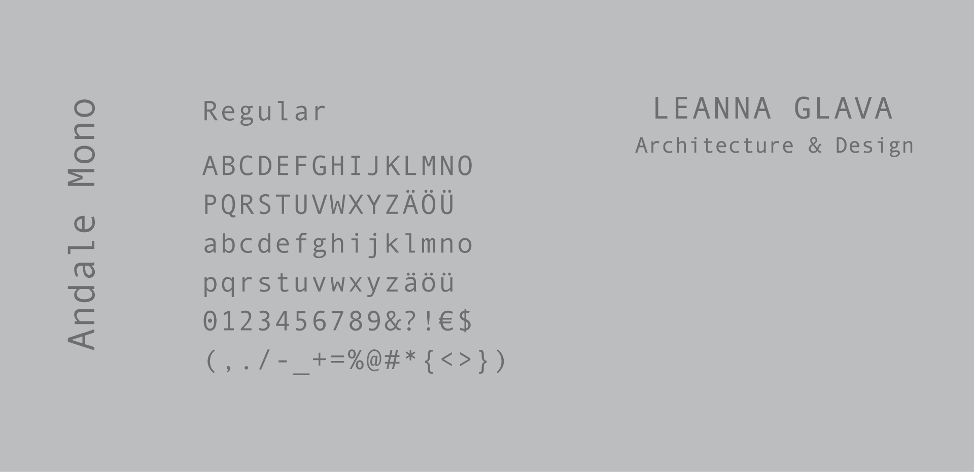
Andale Mono (Regular) was chosen as the primary typeface for the logo title and business card. As a monospaced font, it conveys precision, clarity, and technical rigor, qualities closely associated with architectural drawings and drafting notation. The uniform character width creates a calm, measured rhythm and reinforces the conceptual link between architecture, construction logic, and graphic structure. Its restrained, functional character supports legibility while avoiding stylistic excess.
Andale Mono (Regular) was chosen as the primary typeface for the logo title and business card. As a monospaced font, it conveys precision, clarity, and technical rigor, qualities closely associated with architectural drawings and drafting notation. The uniform character width creates a calm, measured rhythm and reinforces the conceptual link between architecture, construction logic, and graphic structure. Its restrained, functional character supports legibility while avoiding stylistic excess.


Leanna's Testimonial 🙌
Leanna's Testimonial 🙌
I had the pleasure of collaborating with George Saliaris on the design of my logo, and I am extremely satisfied with the outcome. I provided him with an initial sketch as a starting point, which he thoughtfully developed into a refined and highly professional result. He demonstrated a clear understanding of my vision, and the final design truly represents me and my work as an architect. I would highly recommend his services.
I had the pleasure of collaborating with George Saliaris on the design of my logo, and I am extremely satisfied with the outcome. I provided him with an initial sketch as a starting point, which he thoughtfully developed into a refined and highly professional result. He demonstrated a clear understanding of my vision, and the final design truly represents me and my work as an architect. I would highly recommend his services.

© 2026 George Saliaris Graphic & Web Designer LTD
© 2026 George Saliaris Graphic & Web Designer LTD
© 2026 George Saliaris Graphic & Web Designer LTD
© 2026 George Saliaris Graphic & Web Designer LTD